Hi There!
It's been a while since we've talked and there is quite a bit to get through so please bear with me while I show you some of the things I've been busy with. As always, thanks for visiting! And be sure to visit the advertising portfolio here to see some of these images as before and afters.
I'll start off with the most recent work I'd like to share. This is a beautifully shot black and white campaign for the new Kindle Voyage e-reader. I had the pleasure of working with the Kindle Marketing team to help them look their best. You can see these popping up in a bunch of publications these days so keep an eye out. This example is a double page spread (a first for me!) in Vanity Fair.

Keeping with the Amazon theme I'd like to show you some other things I worked on with the
team last year. (I know, it's ancient history at this point but I never got around to posting these last year so sue me :P)
The first one is the campaign for the Kindle Paperwhite e-reader, It was called 'One Chapter Challenge' and the idea is that once you read one chapter on the Kindle you won't go back to reading traditional books. There were a lot of people profiled and asked to provide testimonials of their reading experience. This particular ad was published in People Magazine. The tricky part of this campaign was the amount of white paper background had to be adjustable to neatly fit around the copy in final layout. So to make that possible the background had to be re-built behind the white paper so that it could be moved up an down seamlessly. Of course, you would never know that unless you started to peel back the layers in Photoshop.
The second one is from the Kindle Fire HD campaign last year. This one was interesting because I had to incorporate photographic and computer generated images to come up with the final composite. This particular one was published in Rolling Stone.


The next project is a print ad for Winsdstar Cruises published in Conde
Nast Traveler back in August. I worked on this with the good folks over
at Hey Advertising, using mostly stock images combined with an image of
the ship from the clients library.
This was a project for Seattle's Best Coffee that the kooks at Wexley
School for Girls dreamt up. This is a screenshot of SBC's website. The
creative on this is really fun and I could try to explain but I think
it's better to just go visit them
here to see what it's all about.
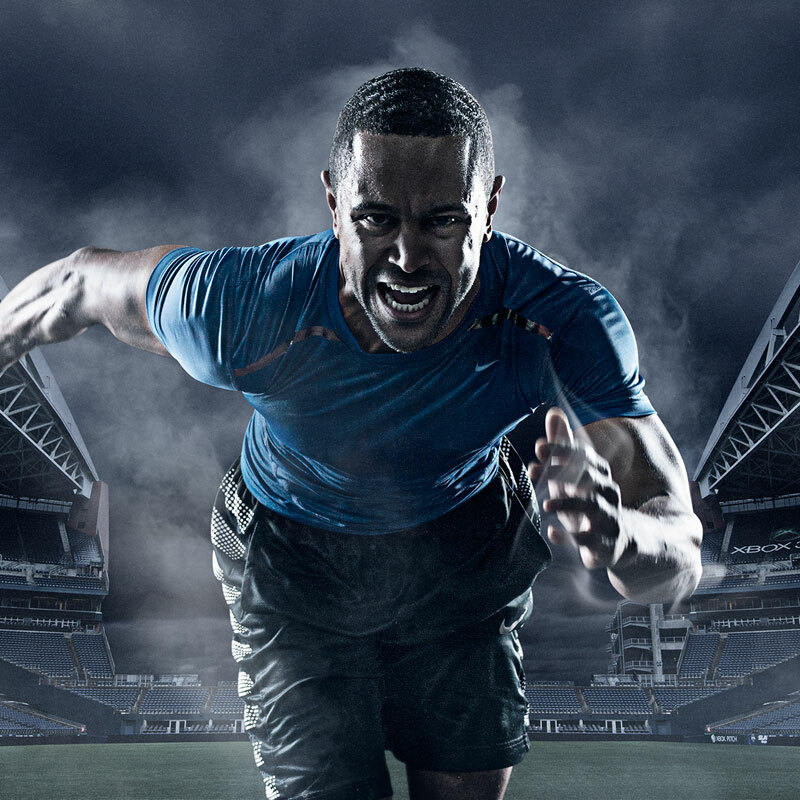
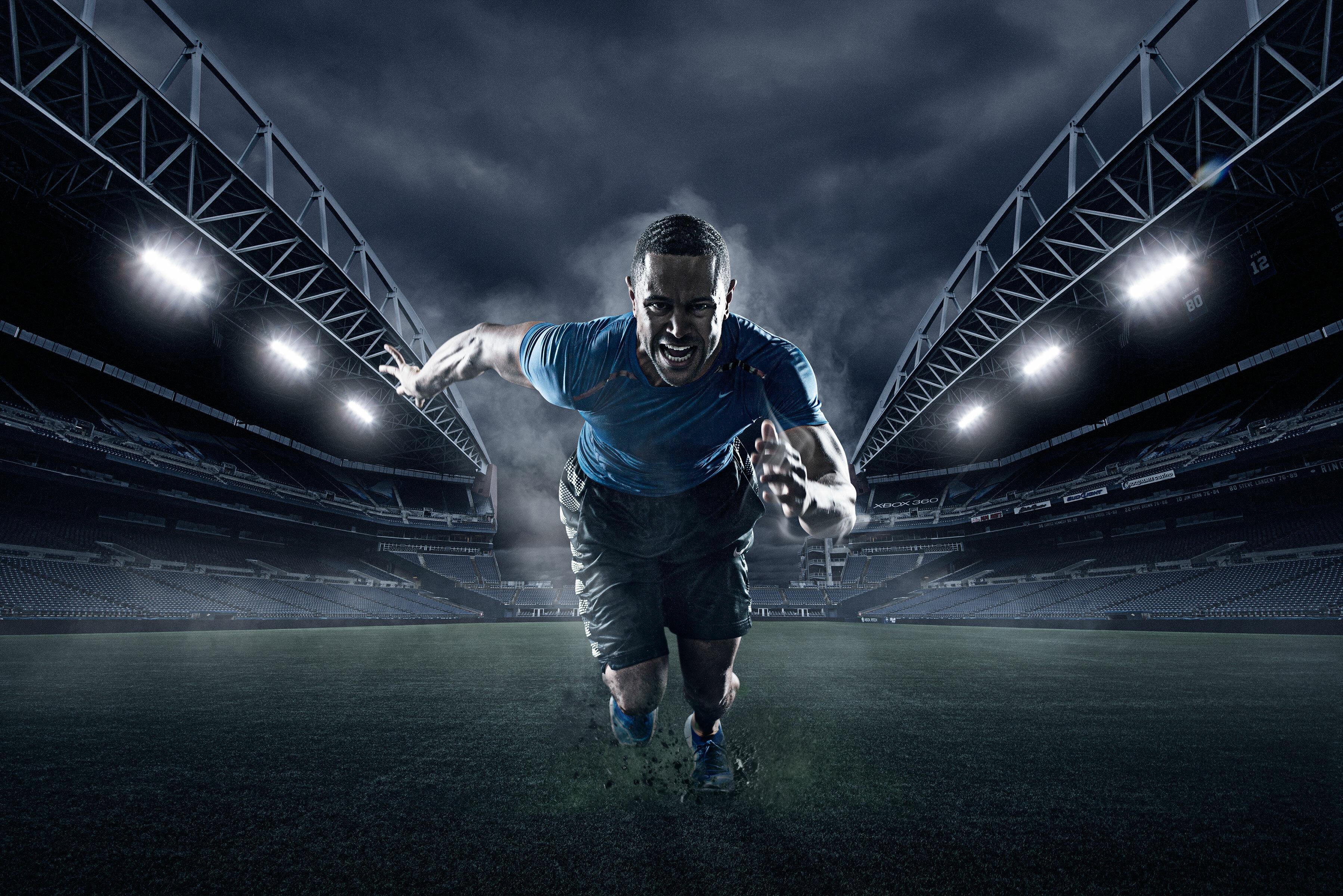
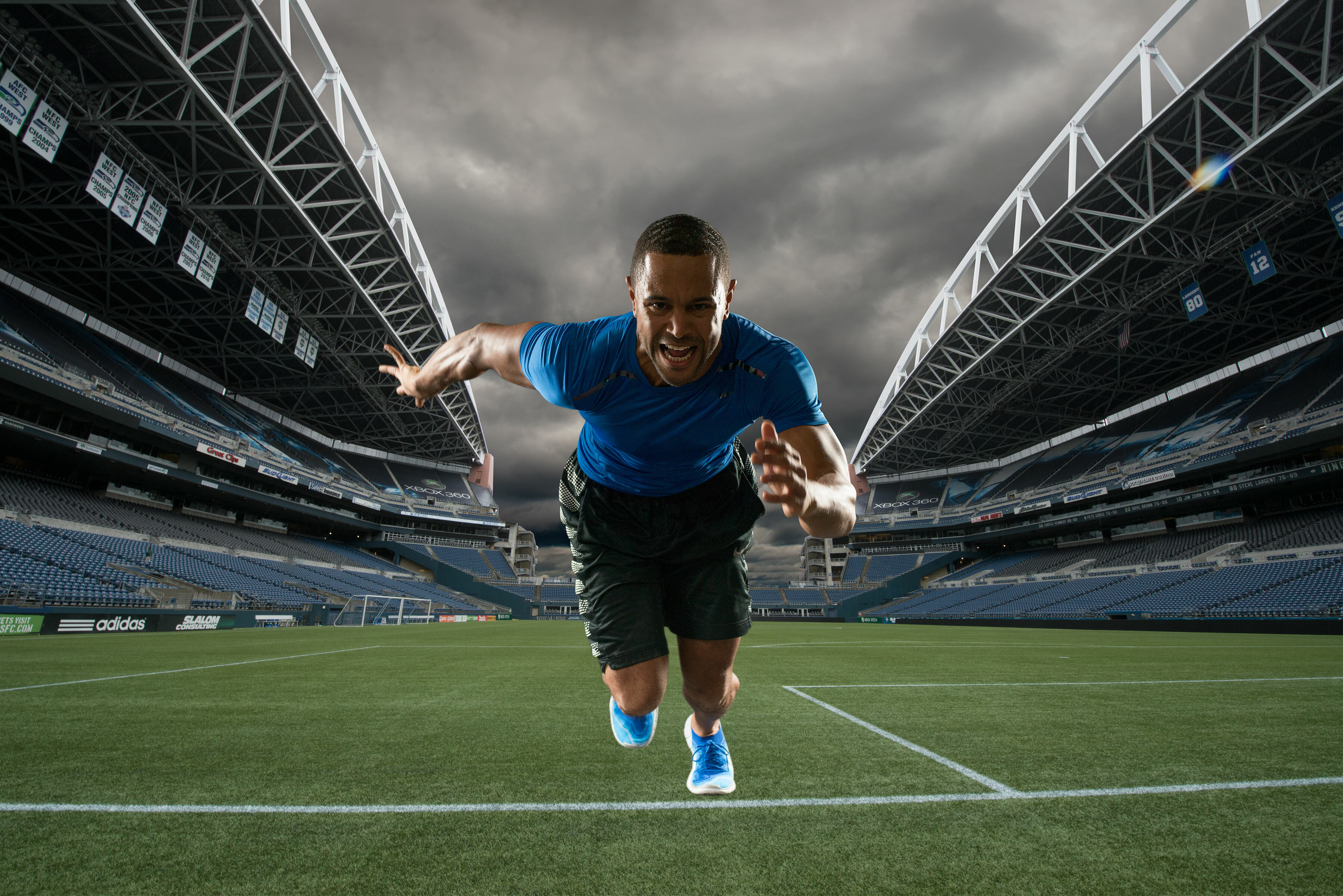
Next up we have a portfolio series I did with bad ass sports action
photographer extraordinaire Ian Coble, please take a moment to check out
his work
here. This was a ton of fun to
work on, since it's obviously very heavy on the composite work. I love
these types of projects because I pretty much have free reign to go wild
and play.
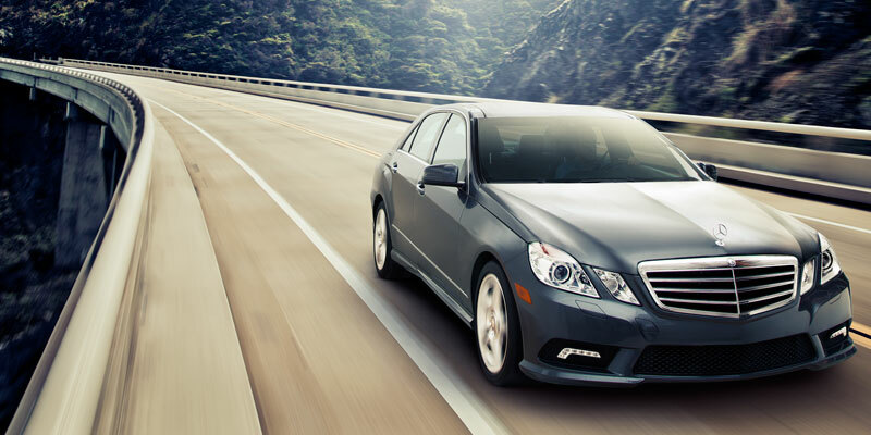


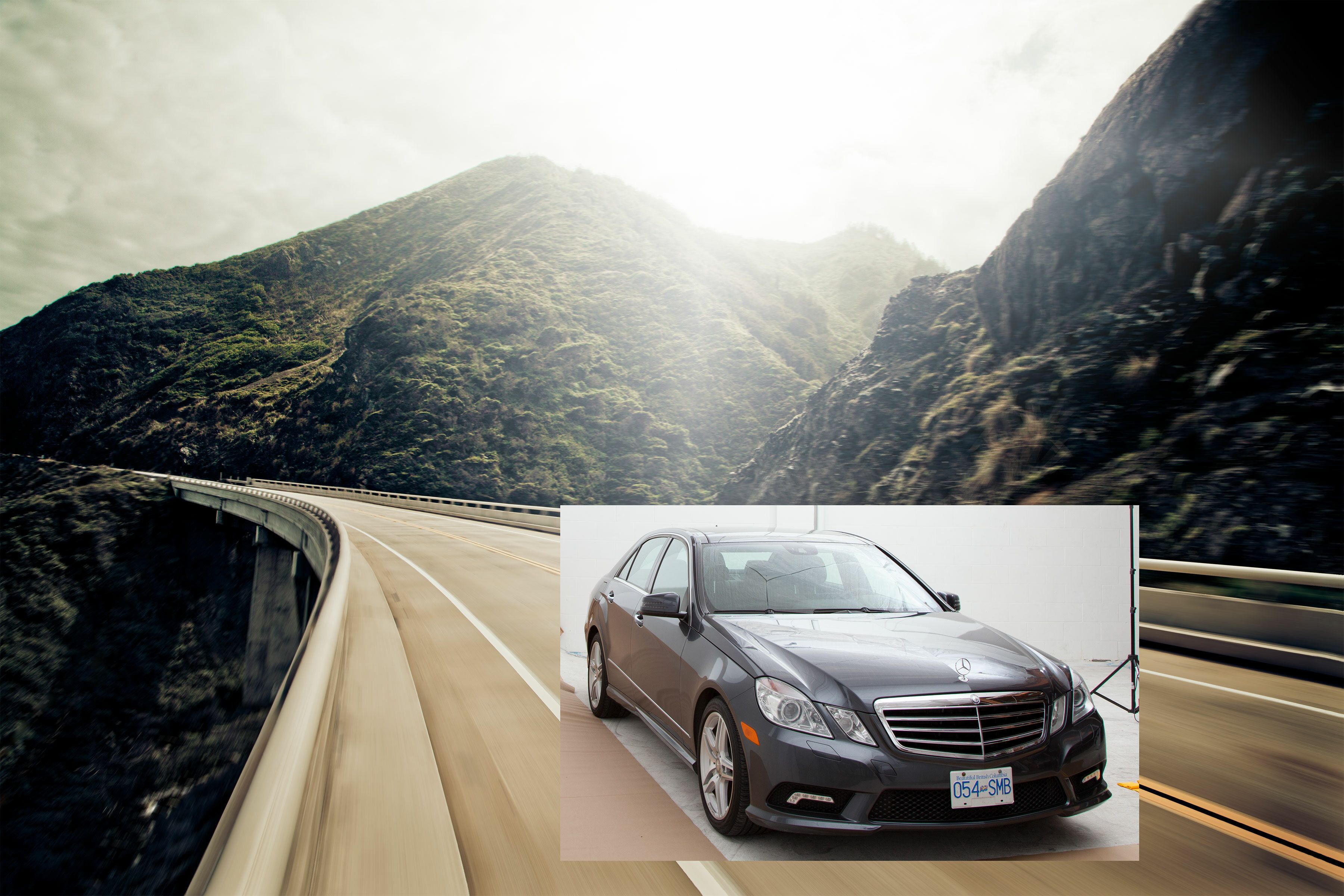
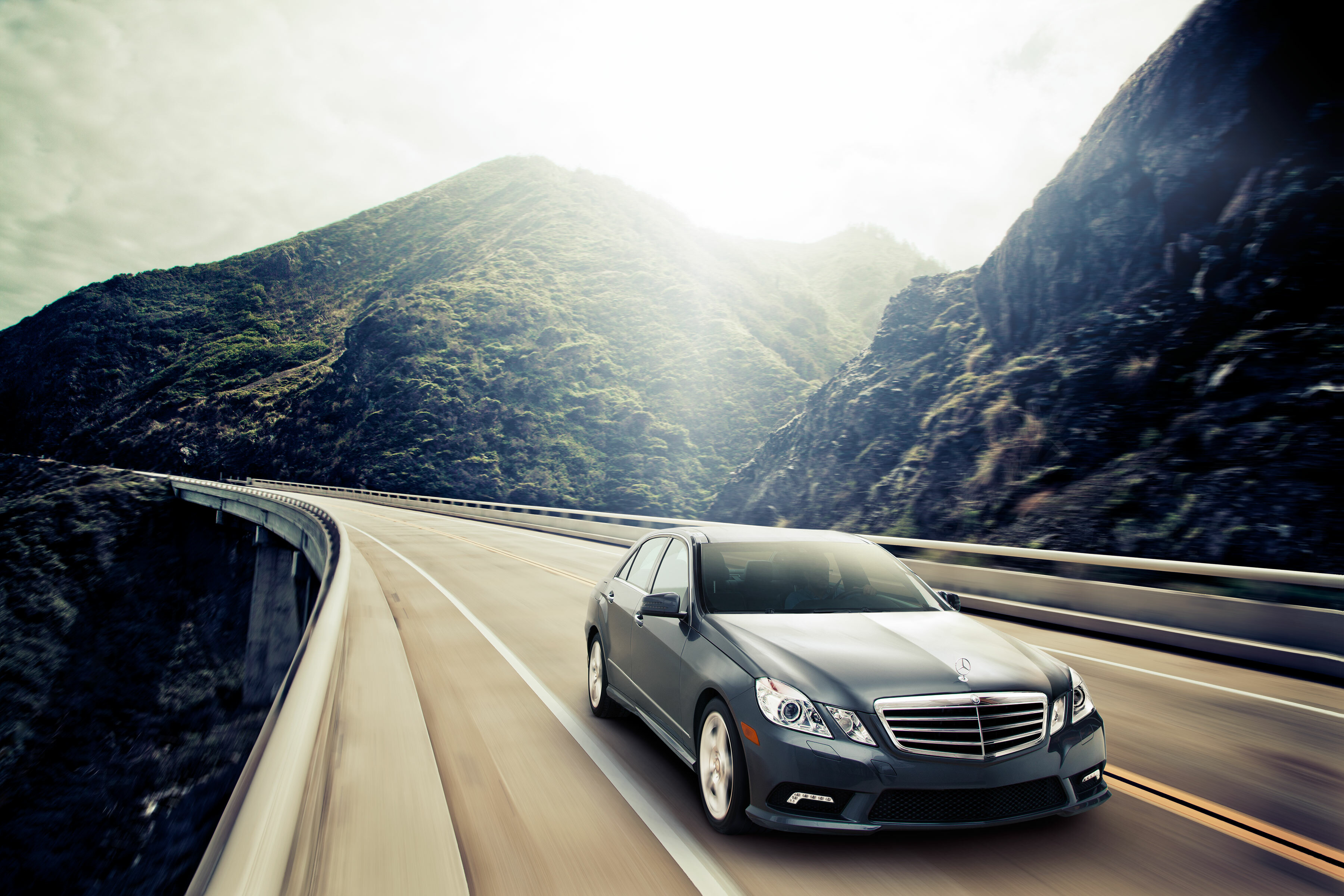
Ok moving right along, here we have a couple of projects I worked with a really talented photographer by the name of
Carlo Ricci. We did a
portfolio series of a variety of cars shot in studio and then composited
into beautiful environments shot all along the west coast.
The other project was the cover of Vancouver Magazine last fall. In this image the chalk art was shot separately and added later in post.

And lastly but not least-ly, this project was the brainchild of my good pal and studio mate
David Clugston and I. David
shot this perfume bottle as a portfolio piece and as you can see the
environment is made up of ink flowing through water. This was a bit of a
mad science experiment to get the right kinds of inks and mixtures to
dilute properly. Below you can see a little stop motion animation of how
it was shot in camera. Basically we ended up mounting the bottle upside
down in a water tank and dropping ink into it at different amounts and
rates to get a variety of frames with ink hitting and engulfing the
bottle. This is another one of those projects we could let our
creativity go wild, good times!


Well that about does for this time around, if you made it this far a
big thanks for sticking around this long. I hope to catch you here again
soon!