Ok, it's time to finally dust this thing off. I know, I know, it's
been way to long since my last post, please don't judge me. As you may
have already noticed this website has a shiny new look so I figured it'd
be a good time to show off some of the stuff I've been working on.
Here's a quick recap of things I've been up to since last summer. Hang
on to your hats!
Towards the end of summer I did a lot of work with Amazon for the
launch of their new Kindle Fire HD and Paperwhite devices. The launch
was kind of a big deal so you might've seen these ads in various
magazines, or on the Japanese subway if you happen to ride it. Also,
there's this website- Amazon.com; lots more of my work there.
Ok, moving right along. Washington State Lotto started
running this series of ads at Sea-Tac Airport, which I had no idea about
until hurrying to catch a flight myself. I grabbed a few snaps on the
down low, hoping security wouldn't think I was casing the joint. You can
still see these ads on some busses here in Seattle.
Here's a better look at a few of these ads, which BTW picked up a few Addy Awards. Good times!
Then we've got a cover for the November issue of Cincinnati Magazine that my pal David Clugston
and I worked on together. It's always fun to collaborate with David. In
this case our challenge was to create a believable filament while
making sure folks could still read it easily. We went through binders
full of versions and actually preferred an earlier type treatment and so
I included the image below.
Finally I did a couple of projects with photographer Adam Levey this winter. The first is a test shot with a Nike cleat wreaking havoc on a soccer field.
The other project was the March cover for Golf Digest Magazine.
Well, thats it for now! Thanks for putting up with my tardiness, and
hopefully, it won't be another eight months until my next post…
It's been a while since we've talked and there is quite a bit to get
through so please bear with me while I show you some of the things I've
been busy with. As always, thanks for visiting! And be sure to visit the
advertising portfolio here to see some of these images as before and
afters.
I'll start off with the most recent work I'd like to share.
This is a beautifully shot black and white campaign for the new Kindle
Voyage e-reader. I had the pleasure of working with the Kindle Marketing
team to help them look their best. You can see these popping up in a
bunch of publications these days so keep an eye out. This example is a
double page spread (a first for me!) in Vanity Fair.
Keeping with the Amazon theme I'd like to show you some other things I worked on with the
team last year. (I know, it's ancient history at this point but I never got around to posting these last year so sue me :P)
The first one is the campaign for the Kindle Paperwhite
e-reader, It was called 'One Chapter Challenge' and the idea is that
once you read one chapter on the Kindle you won't go back to reading
traditional books. There were a lot of people profiled and asked to
provide testimonials of their reading experience. This particular ad was
published in People Magazine. The tricky part of this campaign was the
amount of white paper background had to be adjustable to neatly fit
around the copy in final layout. So to make that possible the background
had to be re-built behind the white paper so that it could be moved up
an down seamlessly. Of course, you would never know that unless you
started to peel back the layers in Photoshop.
The second one is from the Kindle Fire HD campaign last year.
This one was interesting because I had to incorporate photographic and
computer generated images to come up with the final composite. This
particular one was published in Rolling Stone.
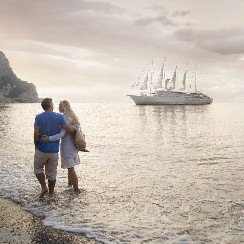
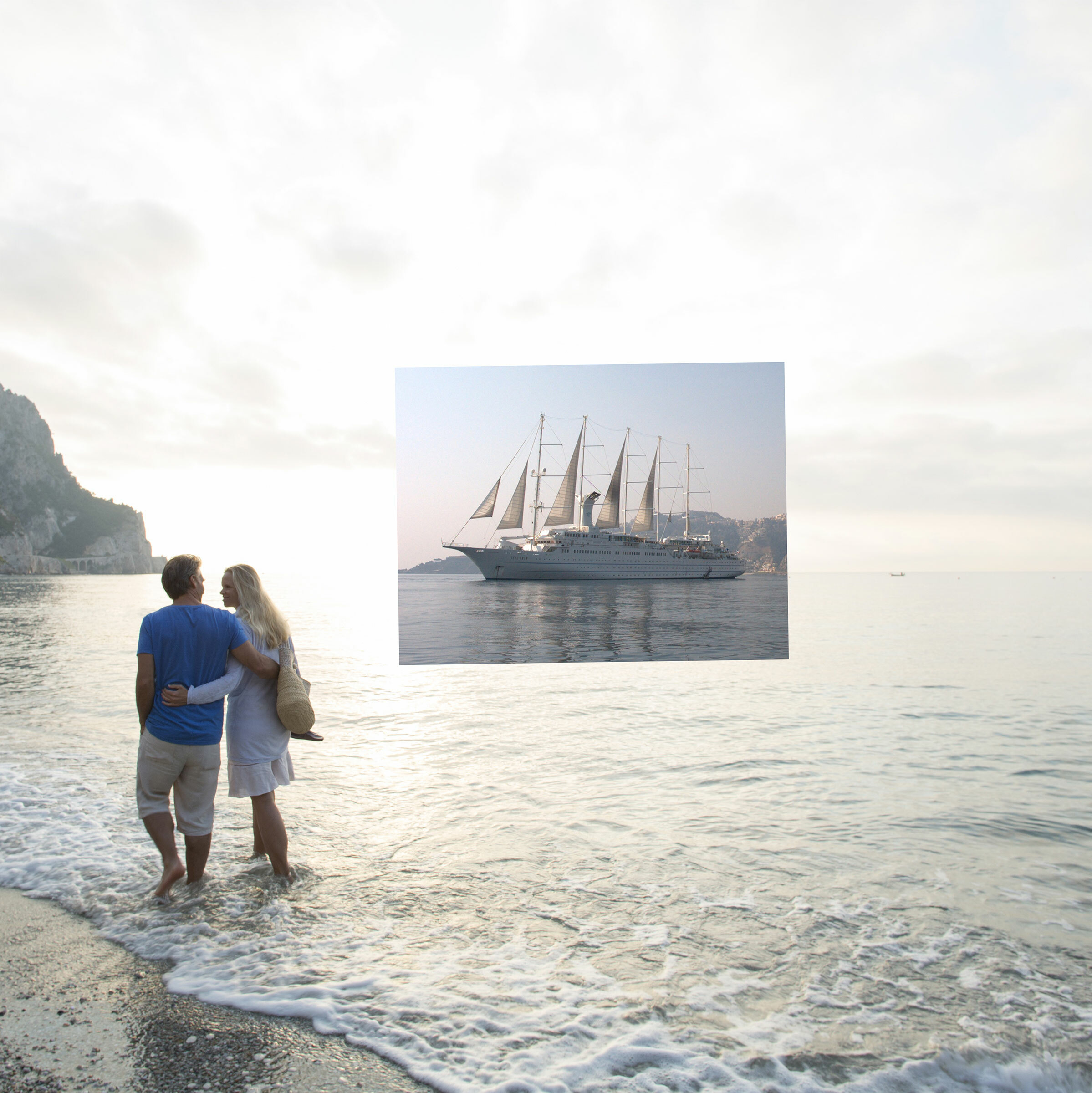
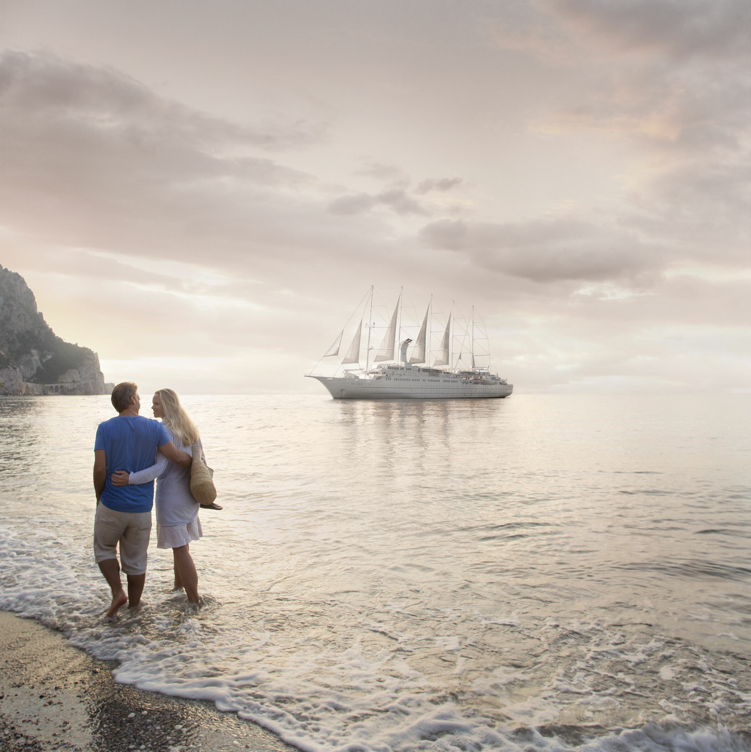
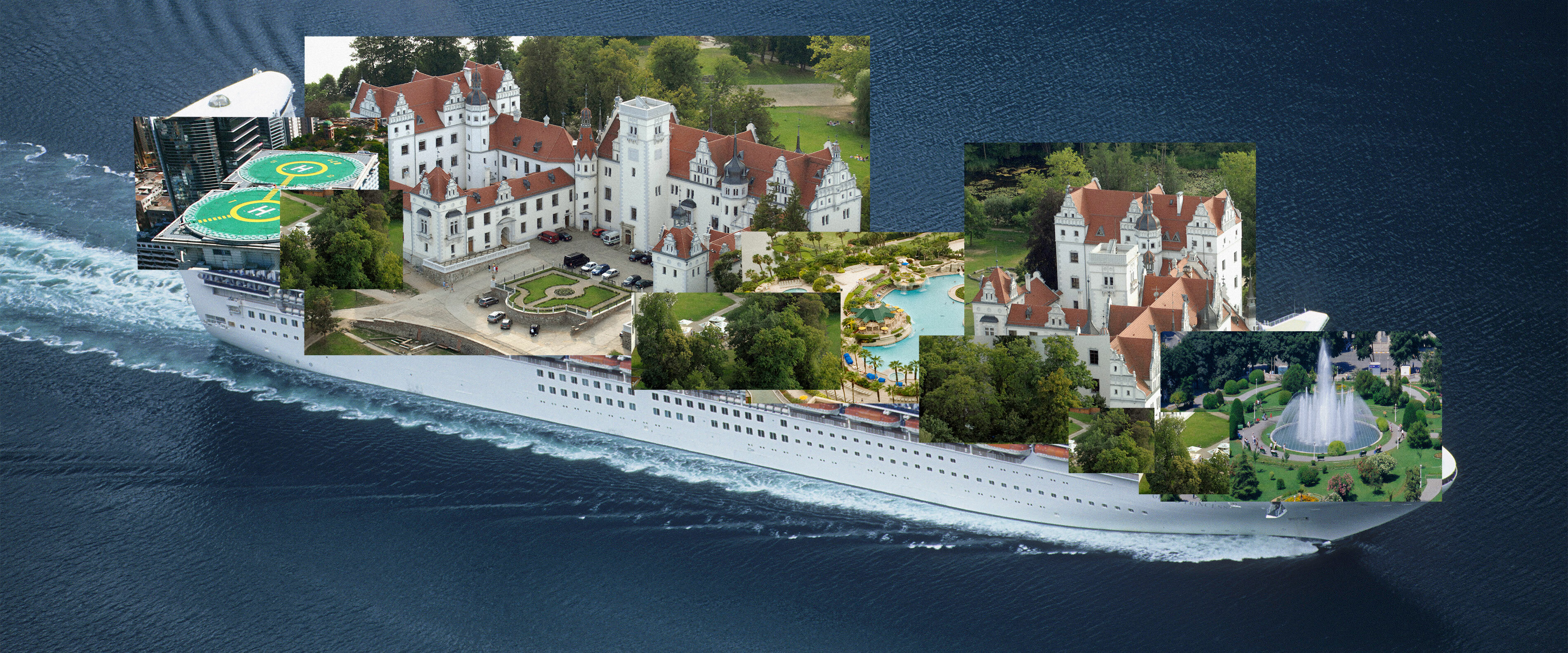
The next project is a print ad for Winsdstar Cruises published in Conde
Nast Traveler back in August. I worked on this with the good folks over
at Hey Advertising, using mostly stock images combined with an image of
the ship from the clients library.
This was a project for Seattle's Best Coffee that the kooks at Wexley
School for Girls dreamt up. This is a screenshot of SBC's website. The
creative on this is really fun and I could try to explain but I think
it's better to just go visit them
here to see what it's all about.
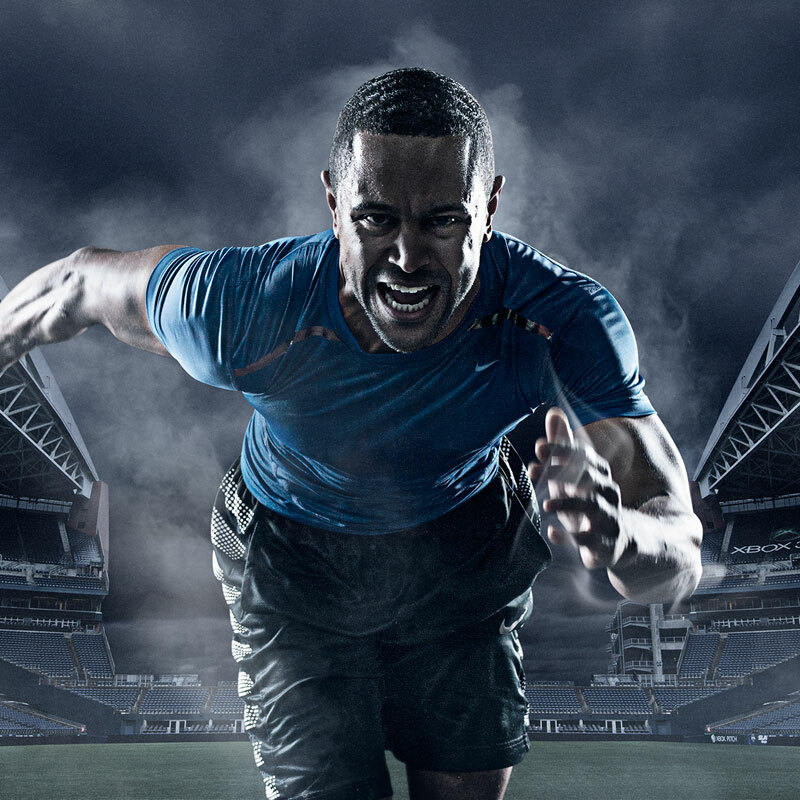
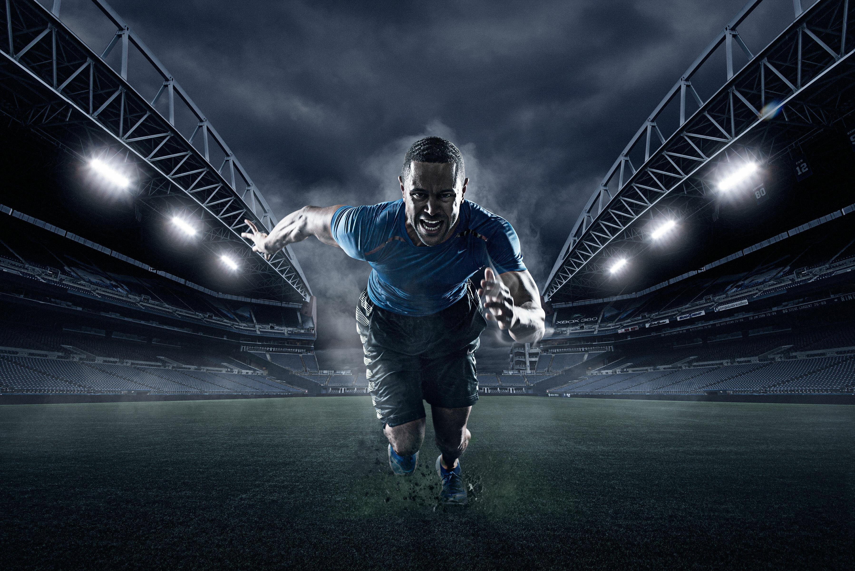
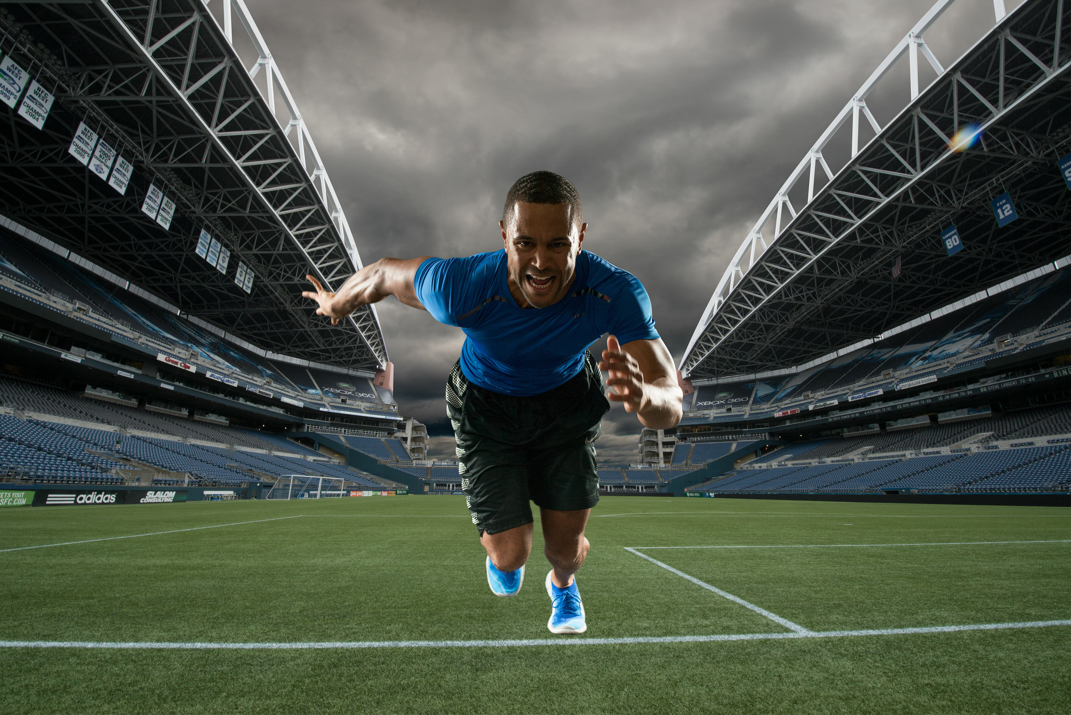
Next up we have a portfolio series I did with bad ass sports action
photographer extraordinaire Ian Coble, please take a moment to check out
his work
here. This was a ton of fun to
work on, since it's obviously very heavy on the composite work. I love
these types of projects because I pretty much have free reign to go wild
and play.
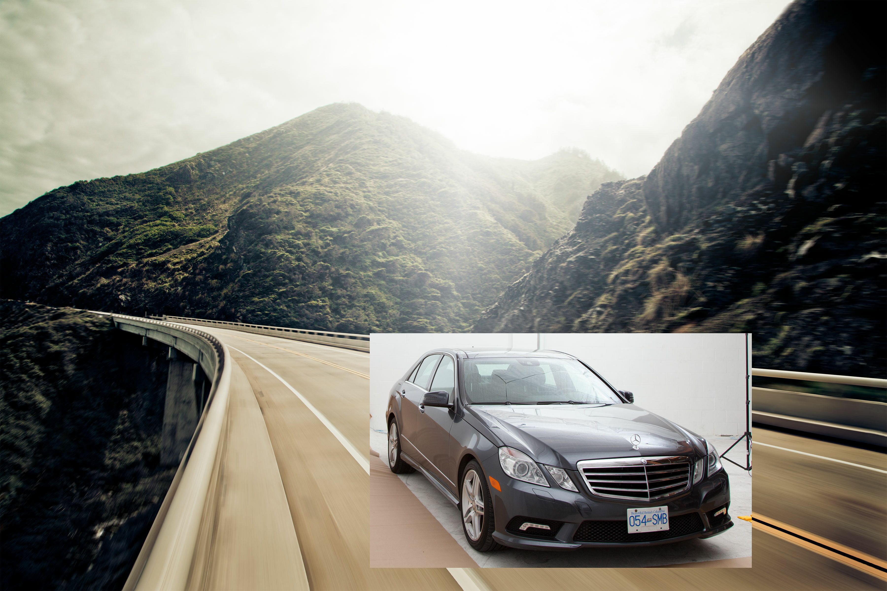
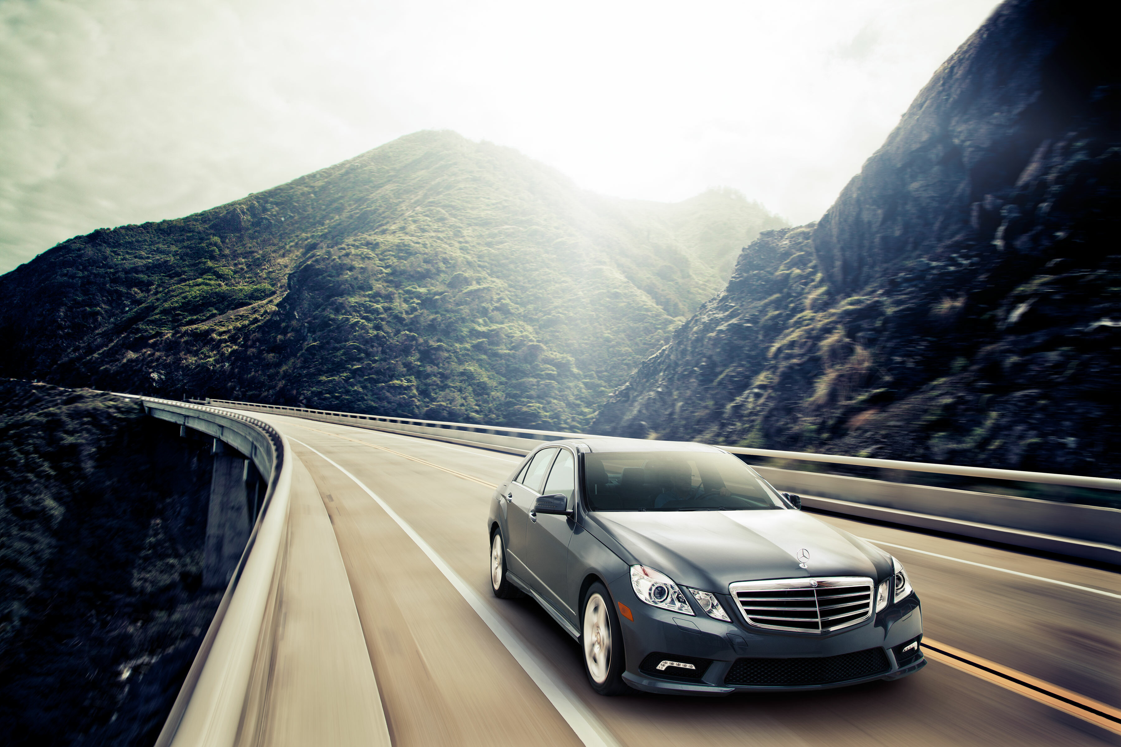
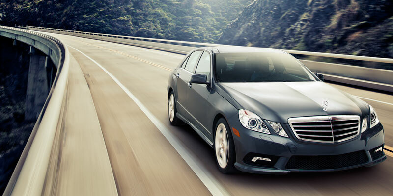
Ok moving right along, here we have a couple of projects I worked with a really talented photographer by the name of
Carlo Ricci. We did a
portfolio series of a variety of cars shot in studio and then composited
into beautiful environments shot all along the west coast.
The other project was the cover of Vancouver Magazine last fall. In
this image the chalk art was shot separately and added later in post.
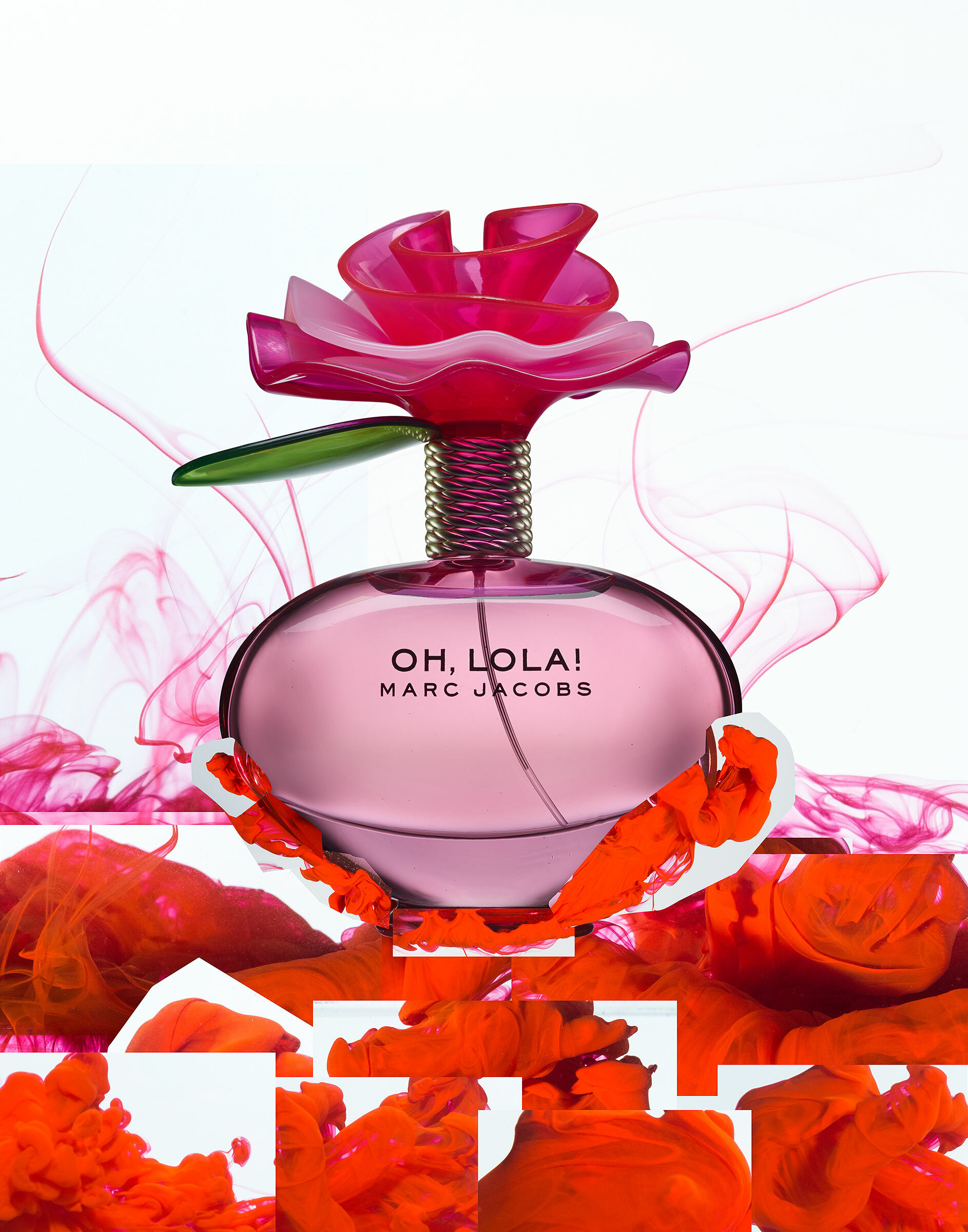
And lastly but not least-ly, this project was the brainchild of my good pal and studio mate
David Clugston and I. David
shot this perfume bottle as a portfolio piece and as you can see the
environment is made up of ink flowing through water. This was a bit of a
mad science experiment to get the right kinds of inks and mixtures to
dilute properly. Below you can see a little stop motion animation of how
it was shot in camera. Basically we ended up mounting the bottle upside
down in a water tank and dropping ink into it at different amounts and
rates to get a variety of frames with ink hitting and engulfing the
bottle. This is another one of those projects we could let our
creativity go wild, good times!
Well that about does for this time around, if you made it this far a
big thanks for sticking around this long. I hope to catch you here again
soon!
The time for my semi-annual blog post has finally arrived, so I'd
like to give you an update, and share a few things I've been working on.
I hope life has treated you all swell-ly in my absence.
Here are a few projects I've had the privilege to work on these past few months.
The good folks at JaegerSloan brought me on to help them with a project they were working on for SquareSpace.
The whole project was shot on a Red camera. I used stills from the
footage to retouch the image used for the video background. You can see
what I'm talking about and the entire series on the SquareSpace site here.
A few months back I worked with photographer Terri Loewenthal on a press shot for the band Rogue Wave. I really like this shot. I don't however envy the prop stylist.
Another fun little project I had the pleasure of working on was the
creation of a photo illustration for Amazon's Sci-Fi/Fantasy imprint
called 47North. This was composited out of about 20 or so stock images.
You can get of some of the original images on the before and after in
the advertising portfolio. And you can see where the final image ended
up being used on the Amazon Publishing site here.
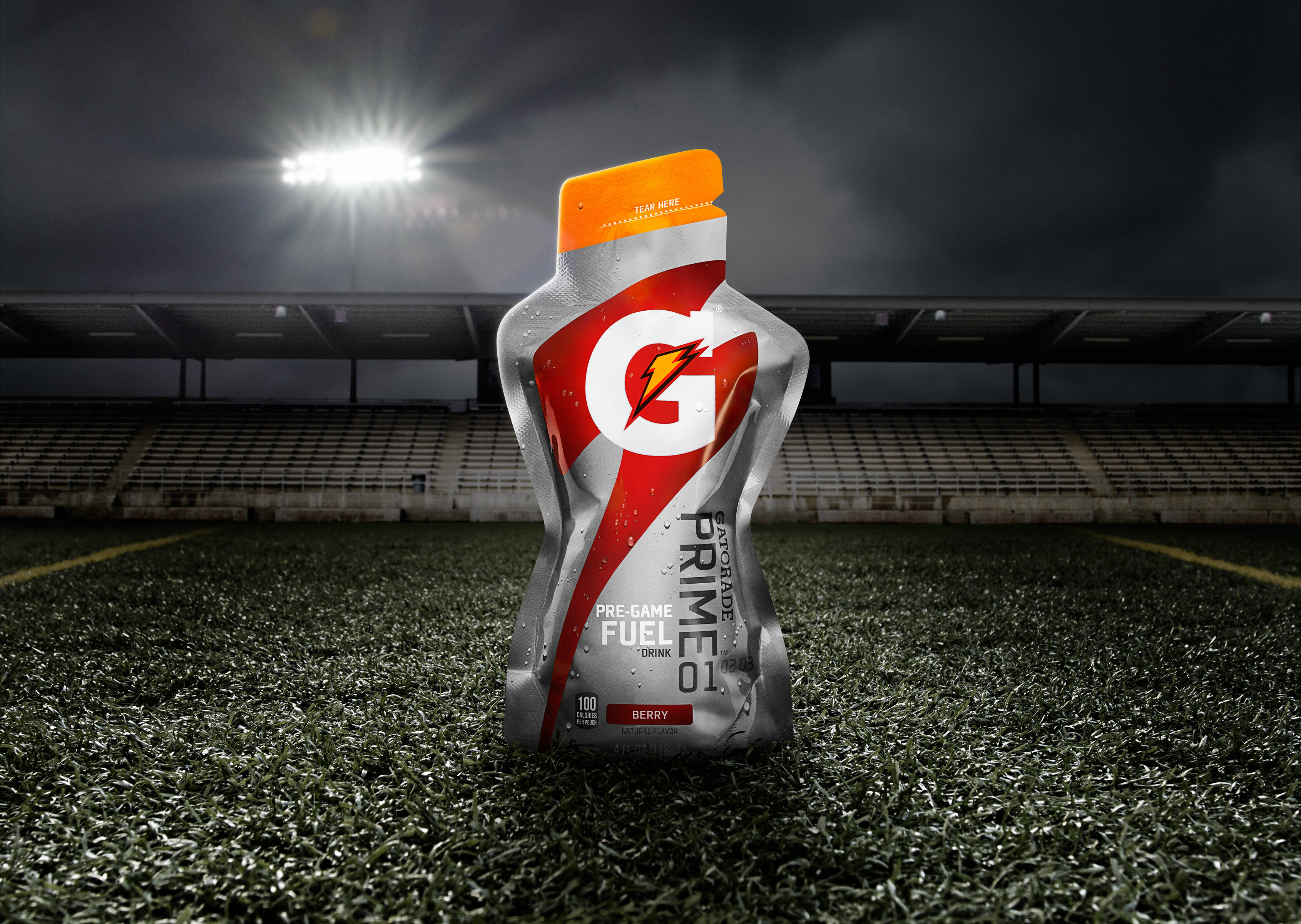
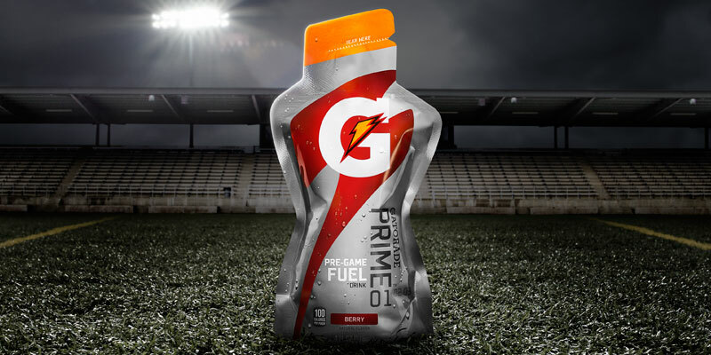
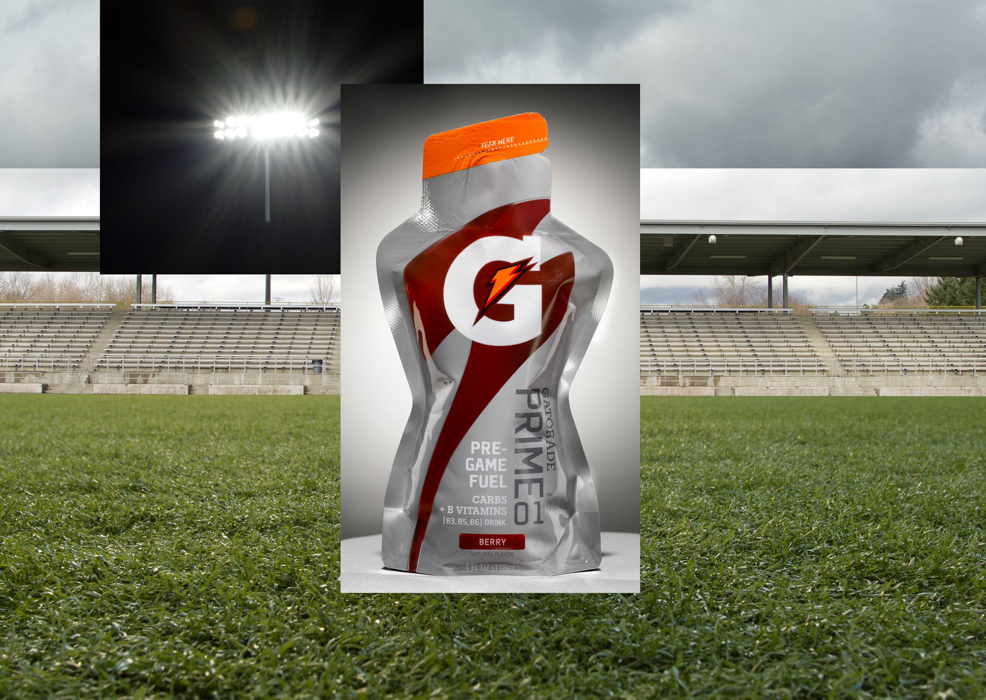
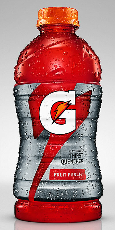
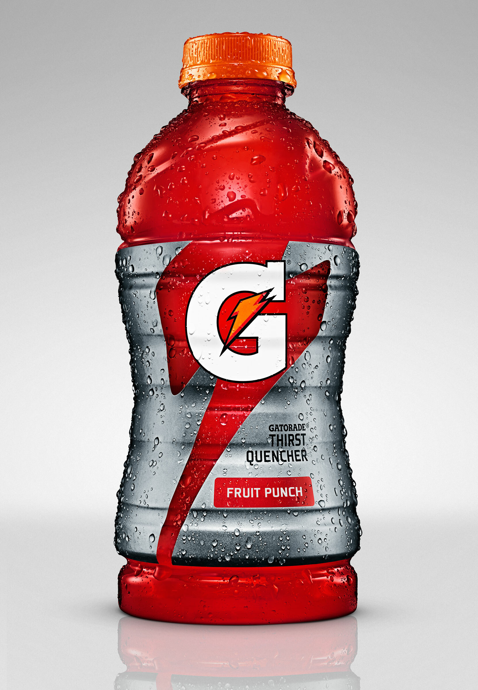
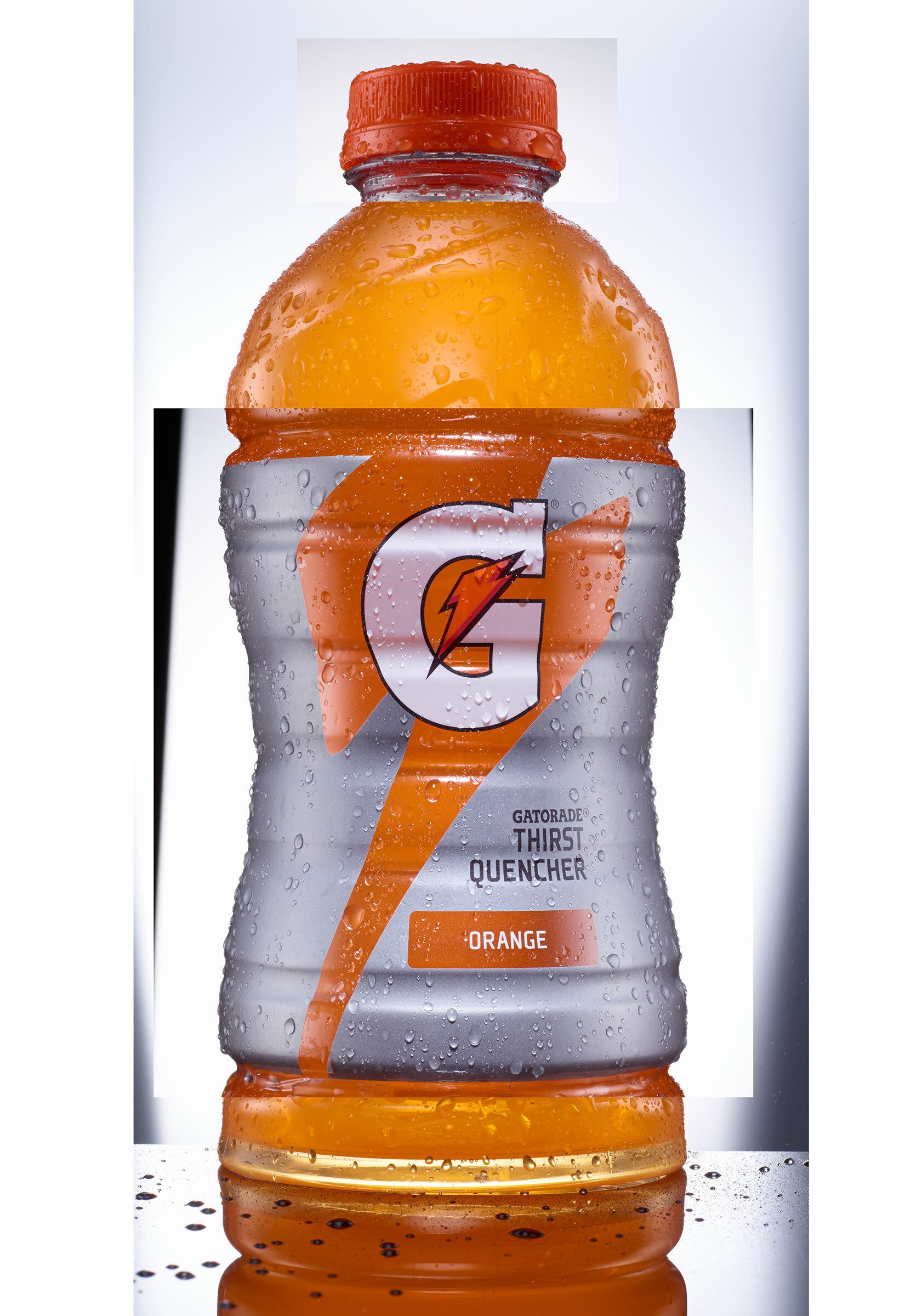
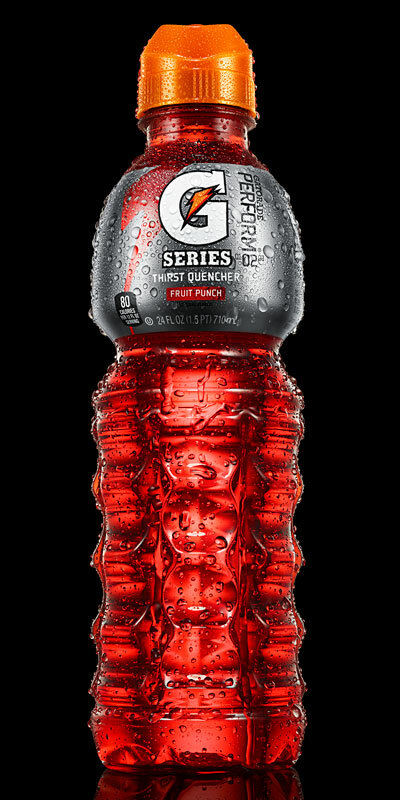
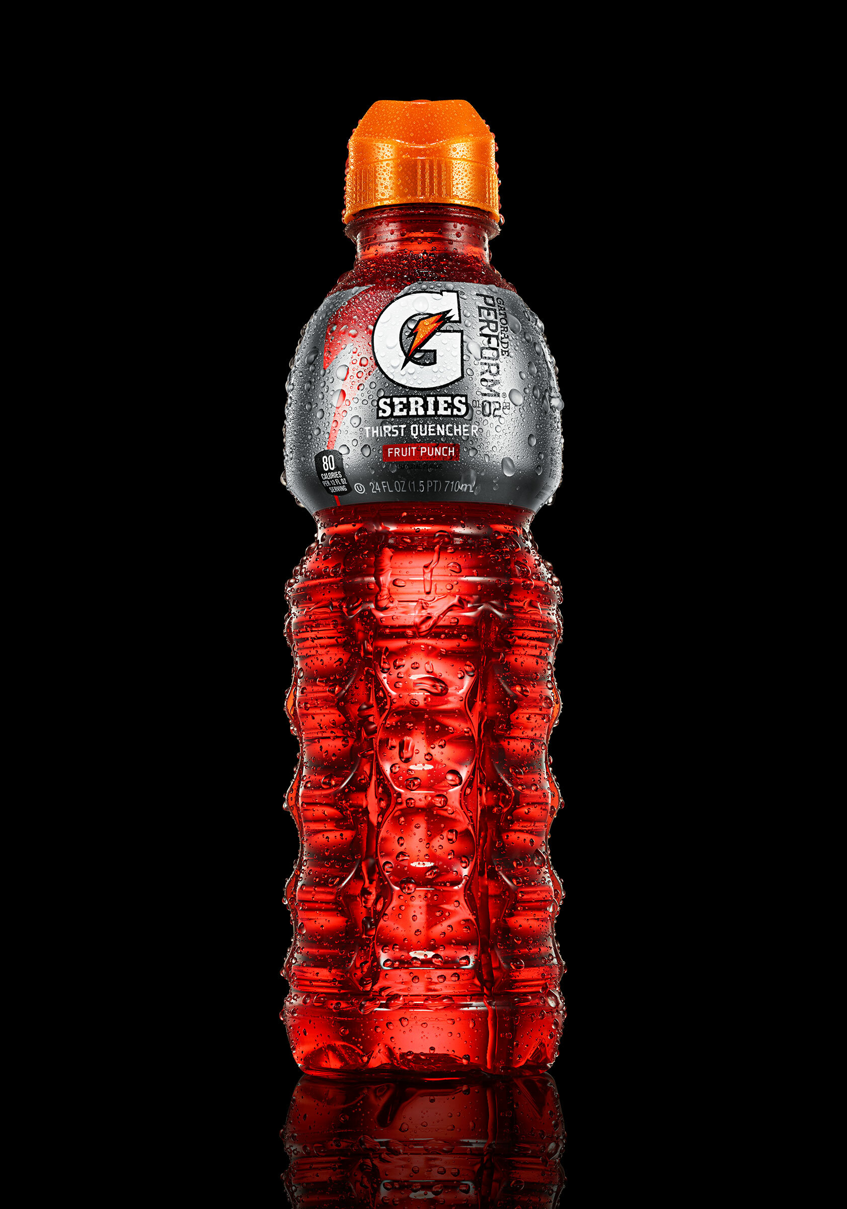
Next up, we have another Gatorade project where I teamed up with my studio mate David Clugston and the great folks over at Tether.
We created a library of about 30 images with the latest form and label
designs. As always it's a lot of fun to be involved in a project from
the very beginning all the way through to the end; to be part of the
creative process and come up with the best approach to shooting. Here is
one of my favorite examples.
And here we have a couple canine themed projects shot by Austin Walsh.
The first one is an ad campaign for Tyson and their line of doggie
treats called Nudges. It was fun to work on this project because I had
freedom to come up with a cool treatment.
The second project involving dogs was a print campaign for
Trifexis, a prescription medication for protecting dogs against
parasites. I really thought the concept and execution of this campaign
was topnotch.
Finally, I wanted to show you a recent collaboration with photographer Patrick Kehoe,
stylist Mandy Kehoe, and Hair and Make-up artist Lindsey Watkins. This
is a really fun series of images created as a self promo project.
Well that about wraps it up for now. I do have a few projects in the works I'm excited to share so stay tuned for more.
Next time you're in the mood for a greasy pretzel, a rhinestone
studded cellphone cover, or observing the rituals of American youth,
head on down to the Westfield Southcenter Mall and check out my work on
the latest Washington State Lottery campaign. Here are some quick pics I
snapped before I was chased off by mall security.
The January 14th issue of Guardian Weekend Magazine features a couple of awesome photos (including the cover!) taken by photographer, Patrick Kehoe
and retouched by yours truly. It's a real honor to have worked on a
project telling stories of courageous protesters, including the one of
this 84 year old woman of the occupy Seattle movement. Dorli Rainey is
one badass grandma and activist! Check out the story and the video of
the interview here.
Check out this months Wired magazine! On the last page there's an image that me and my pal Dave Clugston
collaborated on. Have a look at the step by step video and the before
and after in the portfolio section of the site. The project was a lot of
fun, but the step that took the longest and most patience was drawing
in the hairs to make the spots squared. Later I realized that I missed
one. Find it and you win a puppy.
I've been meaning to post this for a while now but I wasn't exactly
sure if I wanted the world to see one of my working files in all it's
naked glory. It feels a little like I'm airing out my laundry. I decided
to do it anyway because I thought it would be fun to show what goes
into making one of these monster files. I want you all to know that I do
take care in staying organized in building files and I try to stay on
top of naming all of my layers, but sometimes it just gets away from you
and then you end up with this...
in case your curious, this is what the final looks like